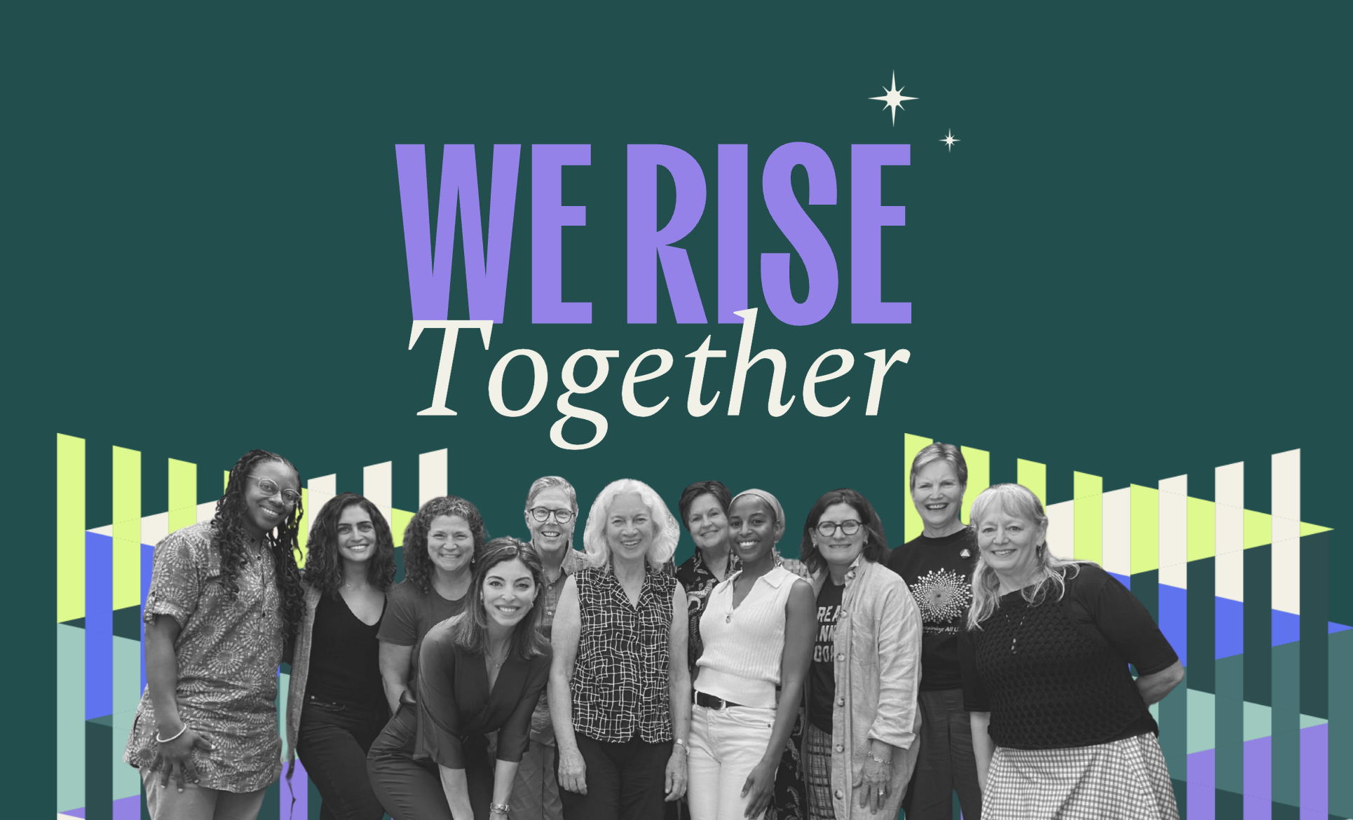
We’re so excited to share a new chapter for our network: the launch of our new branding reflecting who we are as a community and where we’re going together.
Over the past 10 months, our team has taken a deep look at how we as a network show up in the world, through our name and visual identity as well as our messaging and storytelling. Our goal with this project was to ensure that our public face represents the values that guide our work—growth, collaboration, accountability, courage, and curiosity—and that it reflects the powerful community that makes all of our impact possible.
As we dove into this project, particularly around how we position who we are, we wanted to expand what it means to be a donor. Writing a check is one way to make an impact, but our members bring so much more—their connections, influence, time, expertise, and heart. You’ll see this reflected in our messaging.
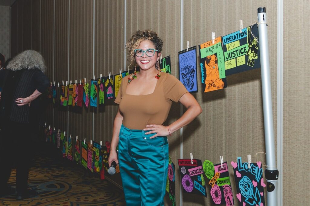
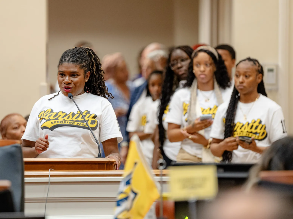
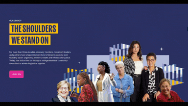
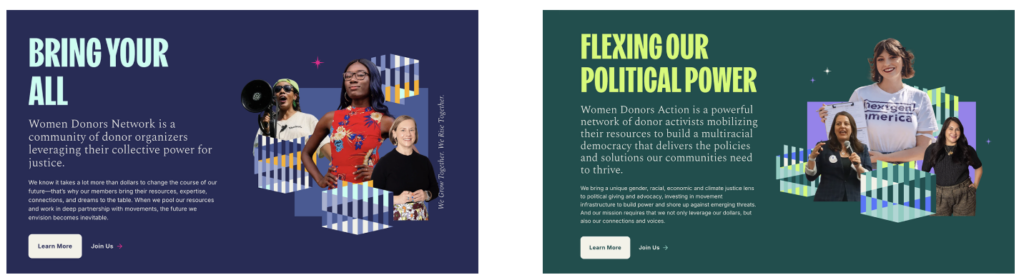
And because it’s such a big part of what sets us apart from other spaces, we wanted to put our multigenerational, multiracial community front and center through our narrative and photography. Our updated websites share the fuller story of our feminist roots, our impact and evolution as a community, and what it means to be a donor today. On the WDN website, you’ll find a timeline highlighting key moments from more than three decades of our work together.
Importantly, this rebrand puts our two organizations on more equal footing. Women Donors Network remains the name of our 501(c)(3). But the name of our 501(c)(4) political and advocacy arm is shifting slightly to Women Donors Action, giving the two organizational names equal weight to reflect their equal importance.
Our new logos feature a shared monogram that reinforces the relationship between Women Donors Network and Women Donors Action. While each organization maintains its own identity through distinct colors, the new monogram visually reflects the synergy between them.
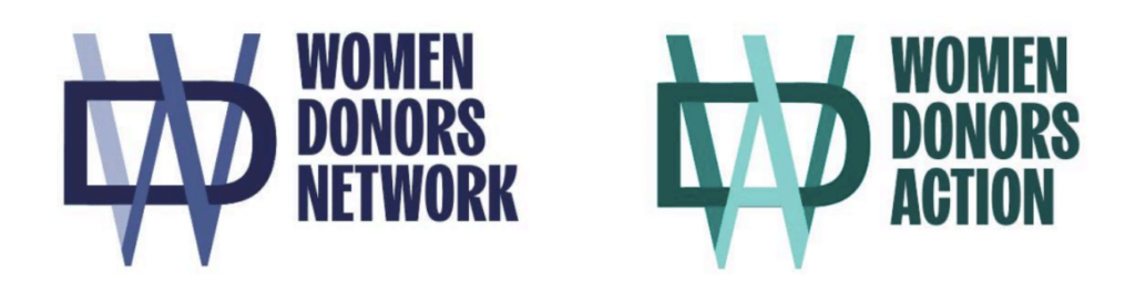
In our new visual identity, you’ll find woven patterns symbolizing connection, plus beautiful imagery that centers our members in action. Bold typography reflecting the weight and urgency of our work pairs with a more delicate font, symbolizing both strength and care. And our new color palettes are anchored in deep green for Women Donors Action and dark blue for Women Donors Network, with pop colors to add energy and emphasis.
Even the small touches have meaning. Constellation motifs reflect how individual points of light connect to form something larger and more powerful. Layered textures and a subtle grit in our photography ground the visuals in authenticity and action.
We hope you’ll spend some time checking out our new websites for both Women Donors Network and Women Donors Action—and share them with someone who might be looking for a place to belong.